How I evaluate machine learning models
2023-11-03
Machine learning Model evaluationContents
- 1 Introduction
- 2 The simplest evaluation
- 3 Building sophistication
- 3.1 Evaluating challenger models against a benchmark model
- 3.2 Evaluating per group
- 3.3 Aside: Grouping columns should not be static
- 3.4 Evaluating multiple challenger models
- 3.5 Aside: Taking it further: Aggregate statistics on model comparison columns
- 3.6 Multiple error definitions
- 3.7 Multiple error statistics and other statistics
- 3.7.1 Multiple error statistics
- 3.7.2 Multiple other statistics
- 3.8 Aside: 'Aggregate' errors
- 4 Further requirements for a full-fledged model evaluation solution
- 4.1 Ability to perform ad-hoc row and column filtering
- 4.2 Ability to order columns in multiple ways
- 4.3 By error statistic (error ordering)
- 4.3.1 By model (model ordering)
- 4.3.2 Sensible colours
1 Introduction
A big part of my job as a data scientist (DS) is to train supervised machine learning (ML) models, make predictions using those models and evaluate those predictions.
The purpose of this post is to describe how I arrived at the solution I now routinely use in my day-to-day work to evaluate my ML models.
2 The simplest evaluation
Just about the simplest model evaluation you can perform is to compute a few rough error statistics for the model you have developed. For a regression task, these error statistics could be e.g. the popular mean absolute error (MAE) and mean absolute percentage error (MAPE) and perhaps the root-mean-squared error (RMSE) (I will give definitions for each of these in Section 3.5). For a single model (call it 'Challenger 1'), this might look like Figure 1 below.
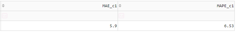
Figure 1 Just about the simplest model evaluation you can perform for a regression task: Compute a few rough error statistics.
This is the sort of evaluation you see in introductory articles and courses on DS. While this kind of evaluation is simple and gives a quick, high-level view of your model's performance, it doesn't give you anywhere near the complete picture for a prediction task involving a hierarchy of categories (business divisions, geographical regions, demographics, products, SKUs) over multiple evaluation periods (weeks or months in the year).
In practice, professional DSs are required to perform much more sophisticated evaluations than this. I have found this to be especially true for model exploration in mature projects, i.e. trying to find a new challenger model that convincingly beats an already well-established, respectable, tried-and-true incumbent model.
Sophistication can be added to the above simplest evaluation in multiple mutually orthogonal directions. These directions will be discussed in the next section.
3 Building sophistication
3.1 Evaluating challenger models against a benchmark model
I make the following claim:
Model performance is (almost) meaningless unless evaluated against a benchmark.
Suppose your model achieves a MAPE of 5%. Is that good or bad? There's no way of knowing until you train a simple but appropriate benchmark model and compare their performance. Assuming your sample of errors is of a decent size and the sampling procedure unbiased, if the benchmark achieves a MAPE of 10%, then you can say with high confidence your model performs better than the benchmark. I wouldn't go so far as to say your model is 'good' yet, but at the very least your model has nontrivially exploited information in the features to make more accurate predictions than naive predictions. On the other hand, under the same assumptions, if the benchmark achieves a MAPE of 1%, then you can say with high confidence your challenger it is 'bad' (There is an asymmetry here. Because I haven't seen a term coined for it elsewhere, I call this evaluation asymmetry. The basic idea is that because good models are of course harder to find than bad models, you should be more sceptical of a seemingly good model than a seemingly bad model. But this idea is beyond the scope of this post and may form the subject of another post).
The reason it is 'almost' meaningless and not 'completely' meaningless is because knowing the MAPE of a model is 5% does in fact convey some information. For example, it may either confirm or refute the preconceptions of business stakeholders about the performance that can be achieved based on their knowledge of current human-level performance ("the procurement team's forecasts are usually off by about 10%") or experience from similar projects undertaken in the past ("we tried doing the same thing last year and the best we achieved was 3%") etc. (But one might argue that these are 'benchmarks' in a sense; the only difference is they exist in the stakeholders' minds rather than explicitly produced by the person performing the modelling).
So the first thing we will add to the simplest evaluation in Figure 1 are the error metrics for a simple benchmark model. This model could be the mean per group (in the case of a regression task), the majority class per group (in the case of a classification model), or the most recent observation (in the case of a timeseries forecasting task). See Figure 2 below.
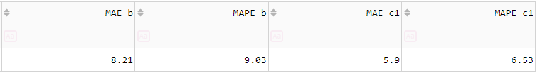
Figure 2 Figure 1 with a benchmark model added.
3.2 Evaluating per group
If your task involves producing predictions for lots of combinations of different categories (e.g. multiple products across multiple regions), single numbers for MAE, MAPE etc. don't mean much. Consider the following figure, where the suffix 'd' means the difference or 'delta' from the benchmark, and I have now added in some colours as a visual aid.
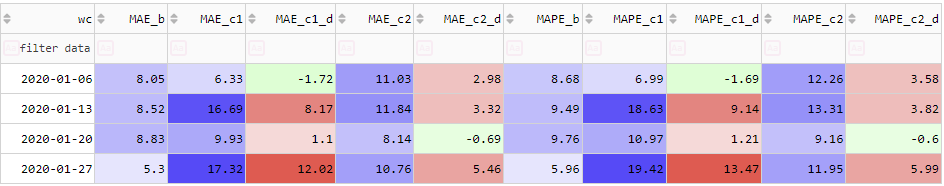
There is no convincing evidence that either Challenger 1 or 2 are better than the benchmark. But now, let's include K1 as a grouping column:
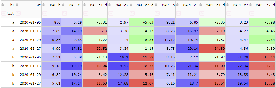
For Challenger 1, when we drill down to the WC-K1 level, there is still no convincing evidence it beats the benchmark. Sure, it slightly beats the benchmark for 3 out of the 8 K1-WC combinations, but it doesn't win by as nearly as much as it loses for the remainder. It calls into question whether the fact it beat the benchmark in those 3 examples is 'meaningful' (statistically significant) or whether it just happened by random chance. Even if their error metrics were roughly the same or Challenger 1 only 'slightly' beat the benchmark, if Challenger 1 is a more complex model than the benchmark (usually the case but not always), applying Occam's razor, we should not accept it.
The story is different for Challenger 2. We see that it convincingly outperforms the benchmark for K1='a' (substantially better MAPE for all of the 4 weeks, just under 5% better MAPE on average). We could implement an ensemble model with a simple rule: Use Challenger 2 for K1='a' but keep using the benchmark for everything else. In my experience it is common and expected for DSs to ensemble their models in this manner - to apply different models to different groups. (As an aside, what I've just described is about the simplest rules-based model ensembling approach. Model ensembling is an active and interesting area of research. See the FFORMA paper).
The fact that different conclusions can be drawn about Challengers 1 and 2 depending on the level of aggregation used to perform the evaluation is a manifestation of Simpson's paradox.
3.3 Aside: Grouping columns should not be static
From a UI/UX perspective, showing results for only a static set of grouping columns is fairly limited and uninteresting. To quickly get an idea of how the model performs at multiple aggregation levels - from the coarsest bird's eye view to a granular ant's level view - they must be able to dynamically group by whatever columns they want, including none at all (which gives a single number for each metric). In Section 5 I show my final implementation of the ideas presented in this post, including this idea.
3.4 Evaluating multiple challenger models
Figure 2 only shows a single challenger (this could be called a binary comparison). In practice, DSs often want to compare multiple challenger models (this could be called a poly comparison). Like for the case of a single challenger, we compute error statistics for each model. But we also need 2 more kinds of columns:
- The difference between the challenger error statistics and those of the benchmark.
- Which model 'wins' WRT each error statistic.
These could be called the model comparison columns.
With these new additions, including a 2nd challenger model, Figure 2 becomes Figure 3 below.
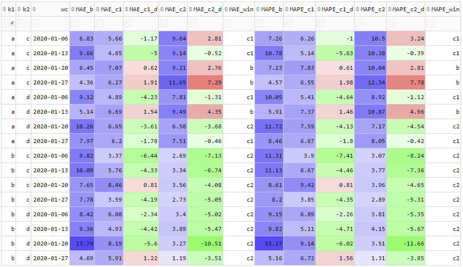
Figure 3 Table 1 with a benchmark model, grouping columns and a 2nd challenger model.
3.5 Aside: Taking it further: Aggregate statistics on model comparison columns
We could take these ideas even further and compute aggregate statistics on model comparison columns. In one of my projects I was asked by a stakeholder the following question: "For each region, which model has the most 'winners' WRT MAE and MAPE computed per region and product?". That is, the ability to specify one set of grouping columns, compute the suite of error metrics and model comparison columns using those, and then to specify a 2nd set of grouping columns (a subset of the 1st) and count up the number of times each model 'won' WRT each metric, and even continue 'rolling up' in this fashion to a 3rd set, 4th set...This would be awesome and I have n ot seen it done anywhere. At any rate, it is decidedly beyond the scope of this post.
3.6 Multiple error definitions
An error is defined as the difference between a prediction and an actual:
- Error (E):

Given an error and actual, we can compute 3 further errors. These are:
- Percentage error (PE):

- Absolute error (AE):

- Absolute percentage error (APE):

And furthermore, we can compute the famous and ubiquitous:
- Squared error (SE):

(I.e. the thing whose sum we minimise to find MLE estimates for the parameters of a simple linear regression model under the assumption of IID Gaussian errors).
3.7 Multiple error statistics and other statistics
3.7.1 Multiple error statistics
The objective of a model evaluation is to understand how well your model performs, and a key step in this process is to summarise the errors mentioned in the previous section using descriptive statistics. Descriptive statistics of errors are also popularly called 'error metrics'.
In Figure 1, there are 3 metrics shown:
- Mean error (MAE)
- Mean absolute percentage error (MAPE)
- Root mean squared error (RMSE)
The formulae for these are well known and are fairly self-explanatory from their names, but I reproduce them here anyway:
![]()
![]()

Where ![]() and
and ![]() (read: 'y hat') are
(read: 'y hat') are ![]() th actuals and predictions, respectively; and the sum is performed over the set of all
th actuals and predictions, respectively; and the sum is performed over the set of all ![]() data points in the group.
data points in the group.
In my experience, for regression models, these are the 3 most popular. But there are several others that could be worth including. In particular, it is sometimes worthwhile to include descriptive stats of the signed errors E and PE:
- Mean error (ME)
- Mean percentage error (MPE)
Whose formulae are analogous to those of the absolute errors. These numbers tell you how much bias there is in your predictions. They should be as close to zero as possible. They are different from the absolute error metrics MAE and MAPE insofar as if they are zero, it does not indicate a 'perfect' model, but it indicates your model is not producing biased predictions (equivalently, your overpredictions perfectly 'balance out' your underpredictions). On the other hand, a MAE or MAPE equal to zero indicates a 'perfect' model.
Moreover, in addition to these relatively straightforward error statistics, there are a few more 'exotic' domain-specific error statistics. These include:
- Symmetric mean absolute percentage error (SMAPE).
- Mean absolute scaled error (MASE). Popular for timeseries forecasting.
Finally, all the statistics mentioned so far are means of different types of error. But there is no reason in principle that we must limit ourselves to means. If we wanted something perhaps more robust to outliers, we could look at medians or other quantiles of the errors. However, in practice, I have seen far less emphasis placed on this, bordering on outright dismissal, so I will not mention it further. The one other error statistic apart from the mean that I think is worthwhile including is the maximum. It gives you an idea of the 'worst-case' performance of the model per group.
3.7.2 Multiple other statistics
There are 2 more descriptive statistics that are very simple but useful to include. These are:
- The mean of the actuals:

- The count of the predictions:

The mean of the actuals in a group gives you a quick indication of the scale of the actuals in that group, which is useful for putting the errors into perspective and knowing which groups are valid to compare. The count of the predictions per group gives a quick indication of the sample size for computing the error statistics and therefore how 'confident' you can be in them. For example, a MAE computed from 1000 numbers is much more convincing than a MAE computed from 10 numbers.
3.8 Aside: 'Aggregate' errors
There is yet another kind of error statistic. I have heard these referred to as 'aggregate errors'. Just like an 'error' is the prediction minus the actual, the 'aggregate error' is the sum of the predictions minus the sum of the actuals. It is mathematically equivalent to the sum of the errors (E's).
![]()
There is also an analogous 'aggregate percentage error':

But note that in this case, it is not equivalent to the sum of the percentage errors (PE's). These statistics are important in a demand planning and inventory forecasting tasks.
4 Further requirements for a full-fledged model evaluation solution
The ideas mentioned in the preceding section can be restated as user requirements for a full-fledged model evaluation software solution. Restated this way, they become:
- Ability to compare multiple challenger models against a benchmark
- Ability to group by any combination of grouping variables
- Ability to compare the performance of multiple models
- Ability to compute multiple statistics of multiple error definitions
The purpose of this section is to outline additional UI/UX requirements for a full-fledged model evaluation software solution. These include, among other things:
- Ability to perform ad-hoc row and column filtering
- Ability to sort columns in multiple ways
- Sensible colours
- Visualisation of the underlying data
4.1 Ability to perform ad-hoc row and column filtering
This is a simple but important requirement from a UI/UX perspective. With all the grouping columns, models and error metrics mentioned above, the screen real estate is quickly exhausted. The ability to quickly filter out only the relevant information is essential.
4.2 Ability to order columns in multiple ways
There are 2 main ways you might want to order the columns in the resulting grid: By error statistic (error ordering) and by model (model ordering).
4.3 By error statistic (error ordering)
In error ordering, the groups are the errors, and within each group is each model's error. Your eyes have to scan across the screen to see how a given model performs WRT other statistics.
This is a sensible default ordering. For each error statistic, you can quickly compare challengers to see which has the best.
The main user story here is when you are starting to perform the evaluation and are deciding which model is best.
4.3.1 By model (model ordering)
In model ordering, the groups are the models, and within each group is each error statistic. Your eyes have to scan across the screen to see values for a given error statistic across all models.
The main user story here is when you have finished performing the evaluation and want to export a summary of the winner's performance, which can then be emailed, included in slide packs etc.
4.3.2 Sensible colours
This is one thing that in my experience just about every data visualisation technology - Excel, BI tools (Tableau, Qlik, PowerBI etc.), Python libraries for data visualisation (Matplotlib etc.) - has utterly failed at. In short, all I want are some 'sensible' green and red colours which highlight the 'good' and 'bad' things. How hard can that be? As it turns out, too hard.
What do I mean by 'sensible' colours? The requirements are:
- Colours should be calculated WRT relevant subtables only - not the entire table.
- Colours should reflect the range of the data values to which they are being applied.
- Ability to specify how the middle and extreme values are defined for positive-negative data.
- Ability to specify whether you want the lower and upper extreme used for colouring purposes to have the same absolute value.
- Ability to specify groups to which a given colouring scheme is calculated.
I will briefly go through each of these. Some of them may or not be obvious. The last 2 in particular require explanation and I have strong feelings about because they are the ones that just don't seem to be done right anywhere.
This is fairly obvious, but I have seen it not being followed. To calculate the colour for a specific cell, only a relevant subset of the table (I will call this a subtable) should be used. For example, suppose we are colouring a grid containing both MAE and MAPE values. Depending on the scale of the underlying numbers, the MAEs could be orders of magnitude different from the MAPEs (e.g. for annual sales data, MAEs could be in the 100's or 1000's but the MAPEs could only be up to 20%). For this reason, when calculating the colour for a given MAE cell, it must use only the subtable consisting of the MAE columns and not the entire table. See Figure 4 below
For subtables which contain only positive values (e.g. absolute metrics such as MAE and MAPE), the colour palette should be a single colour whose lightness varies depending on value. In terms of the HSL colour system, it should have a constant hue (I think blue 240 is a nice default but it's up to user preference) and saturation (sensible default: 100%) but a lightness which reflects the value. The lightness should vary from a touch above 50% (e.g. 55%) for the biggest values to a touch below 100% (e.g. 95%) for the lowest values.
For subtables which contain both positive and negative values (e.g. the error delta columns), the colour palette should be 2-colour. In terms of the HSL colour system, it should have 2 different hues (one for positive and one for negative values), a constant saturation (sensible default: 100%) and a lightness which reflects the value . A sensible default is green-white-red.
For a model comparison, the middle value is always 0. This makes sense: Either your challenger model has a better or worse error statistic than the benchmark (strictly speaking they could coincidentally be equal, but this is a fluke).
The definition of the extreme values is a little more subjective. The simplest approach is to take the minimum and maximum. However, this makes our colouring scheme sensitive to outliers. If we want our colours to be robust to outliers, we should specify the minimum and maximum as our (subjective) cutoffs for outliers. Popular ways of defining outliers include:
- Anything above the xth percentile, where x is usually 90 or 95.
- Anything outside Tukey's fences (1.5 IQRs outside the 1st and 3rd quartiles).
This is nothing new. Excel has had this ability for years.
This is something Excel and a lot of BI tools either don't have the ability to do or make it unnecessarily complicated to do, yet it's so simple and obvious. An example is needed. Consider the following:
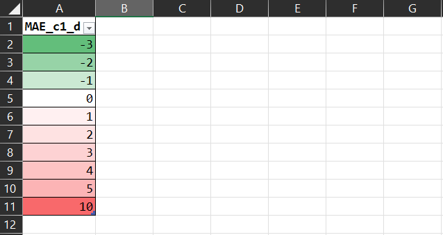
The colours are all wrong. Why is the -3 as 'green' as the 10 is 'red'? Technically, why is their lightness (L in the HSL colour model) the same? It's misleading because at a glance it looks like the 'win' of the MAE of -3 'balances out' the 'loss' of the MAE of 10. It should really be:
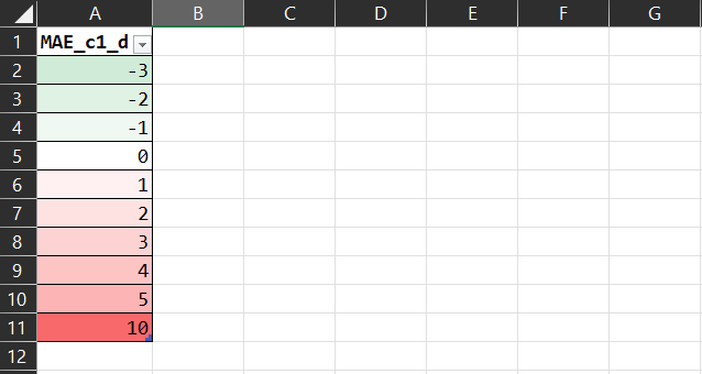
That tells the story more faithfully.
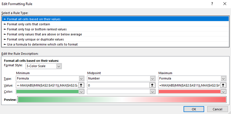
I should mention that this is possible to do with a bit of Excel ninjitsu. You set the minimum and maximum to be defined by the following formulae:
=-MAX(ABS(MIN(RANGE)),MAX(RANGE))
=MAX(ABS(MIN(RANGE)),MAX(RANGE))
In a screenshot:
Still, I find this needlessly complicated. It should be the default behaviour.
4.4 Visualisation of the underlying data
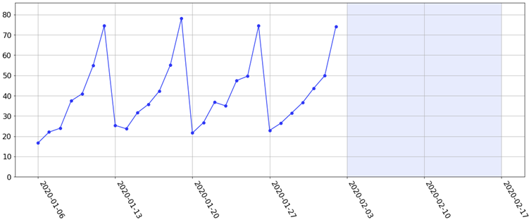
I should mention in passing that not even all the errors and their statistics 'tell the fully story' about how a model is performing. To illustrate this, suppose we have many weeks' worth of data with a strong weekly seasonality. The last 4 weeks might look like the following figure. Suppose our task is to forecast the next 2 weeks ahead (the light blue shaded region).
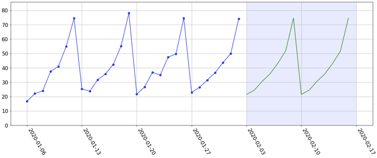
Since there is a strong weekly seasonality, we might fit e.g. a simple Holt-Winters exponential smoothing model. This gives us the following sensible-looking forecasts:
Fast-forward 2 weeks and the actuals have come in. They look like this:
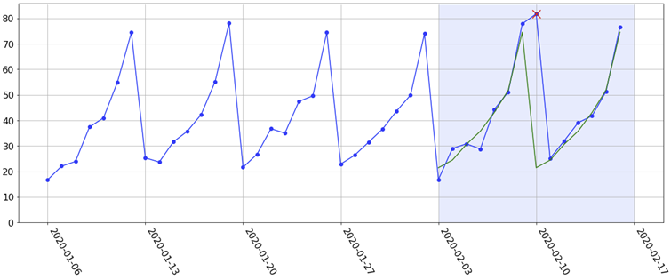
For whatever reason (which may be a valid reason based on events on that day), the 7-day seasonality in the historical data was not actually realised on the 2nd Monday during the testing period (indicated by the red cross). In other words, it 'stayed high when it was supposed to be low'. As a result, the forecast for that Monday is way off. Now, suppose that this is just one of hundreds or thousands of forecasts we have produced. Without actually visualising the data, this would just be a 'blip' on the evaluation grid I have been showing (it would definitely show up in the maximum absolute error, but it may be smoothed out in the mean absolute error). By only looking at the grid, who is to say why we're seeing this big error? Is it (a) the 'model's fault' or (b) the 'data's fault'? That is, is our model capacity too high, resulting in a complex model with high variance (e.g. a random forest with only a few deep trees)? Or is it an anomaly in the data? This is not answered by the grid alone. However, by actually visualising the data and forecast, we can safely conclude that the model 'did nothing wrong' and that it is an anomaly in the data.
In fact, the first thing you need to do to understand how your model is performing is to visualise the data and predictions themselves. How easy or difficult this is depends among other things upon the dimensionality of the data you are predicting. Univariate timeseries forecasting or simple linear regression are perhaps the easiest to visualise.
5 My implementation
Excel and the BI tools I have tried (PowerBI and Tableau; I can't speak for Qlik) do not meet all the requirements outlined in this post. So I have implemented my own model evaluation solution in Python using the Dash framework by Plotly, which I use to evaluate all my models. In this final section I will demo some of its features.
Screenshot:
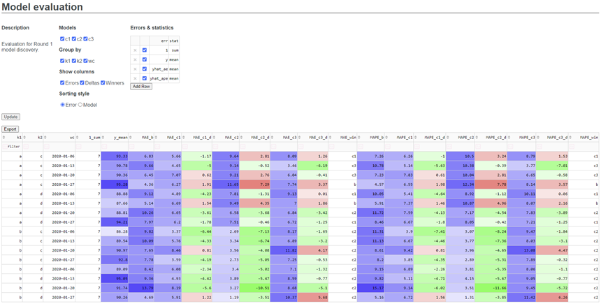
There are 2 main parts: The Header and the Grid.
The Header accepts inputs from the user via checkboxes, radio buttons and an editable grid. It contains the following:
- Description: A short description of the evaluation being performed.
- Models: Allows the user to specify which models to include. For the purposes of this demo, I have included 3 challenger models named C1, C2 and C3.
- Group by: Allows the user to specify which columns to group by. For the purposes of this demo, there are 3 columns available to group by, which I have called K1, K2 and WC (week commencing). If none are selected, no grouping is performed.
- Show columns: Allows the user to specify which columns to show. This includes errors (MAE, MAPE etc.), error deltas (differences in errors between each challenger model and the benchmark) and winners (which model 'won' WRT each metric).
- Column ordering style: Allows the user to specify the column ordering style (error or model ordering).
- Errors and statistics: Which error-statistic combinations to compute.
Below the header is the Grid, which displays the results.
Now, let's have a play around with it.
By default, the Grid shows all models, columns and error-statistic combinations specified in a user-editable configuration file. Let's look instead only at Challengers 2 and 3, group by just K1, look at the delta and winner columns only and remove the maximum errors. Then let's add in a new error statistic: The median absolute error. Finally, we'll add back in the other 2 grouping columns and produce a summary table comparing Challenger 2's performance with that of the benchmark WRT our 3 error statistics.
5.1 Further development ideas
- Ability to specify how error deltas are defined - as absolute or percentage differences (or both).
- Ability to perform even more ad-hoc column selection by e.g. entering regexes into a search bar.
- Ability to specify how outliers are defined per error-statistic for colouring purposes. This could be done as a separate column in the Errors & Statistics selection table.